
Modernizar e Preservar
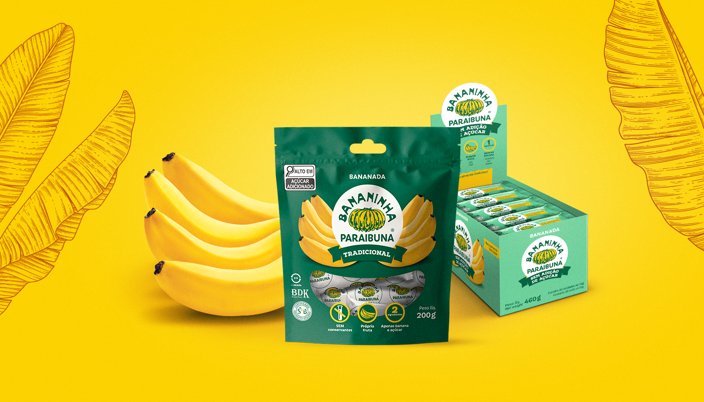
Orgulhosamente do Vale do Paraíba, mas vendida em quase todo o Brasil (e também fora dele), Bananinha Paraibuna® quase completando 50 anos de idade merecia um redesign de embalagem completo. Com as exigências da nova legislação entrando em vigor, encontramos o momento certo para passar a limpo toda a linha de embalagens Bananinha e ainda criar alguns novos produtos. Nosso desafio principal era modernizar a identidade visual sem mexer na marca, reduzir a quantidade de cores com benefício no custo de produção, bem como definir um padrão marcante para as variedades facilitando a navegabilidade do consumidor no ponto de venda, já que muitos consumidores e clientes relatavam dificuldade na identificação de algumas variedades na hora da compra.
Modernize and Preserve
Proudly from the Paraíba Valley, but sold almost everywhere in Brazil (and beyond), Bananinha Paraibuna®, almost 50 years old, deserved a complete packaging redesign. With the requirements of the new legislation coming, we found the right time to clean up the entire Bananinha packaging range and also create some new products. Our main challenge was to modernize the visual identity without changing the brand, to reduce the number of colors with benefits in terms of production costs, as well as to define a striking pattern for the varieties, making it easier for consumers to navigate at the point of sale, since many consumers and customers reported difficulty in identifying some varieties at the time of purchase.
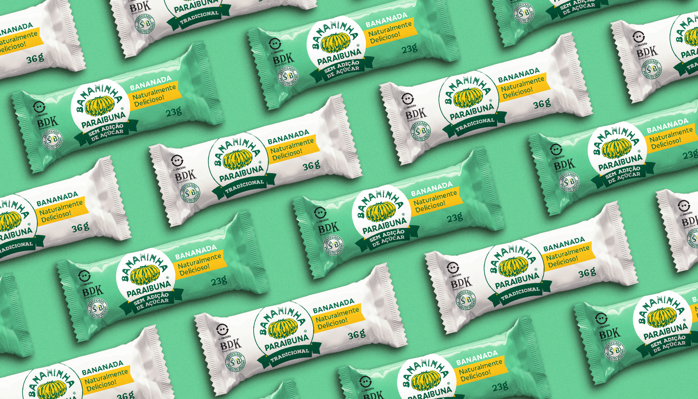
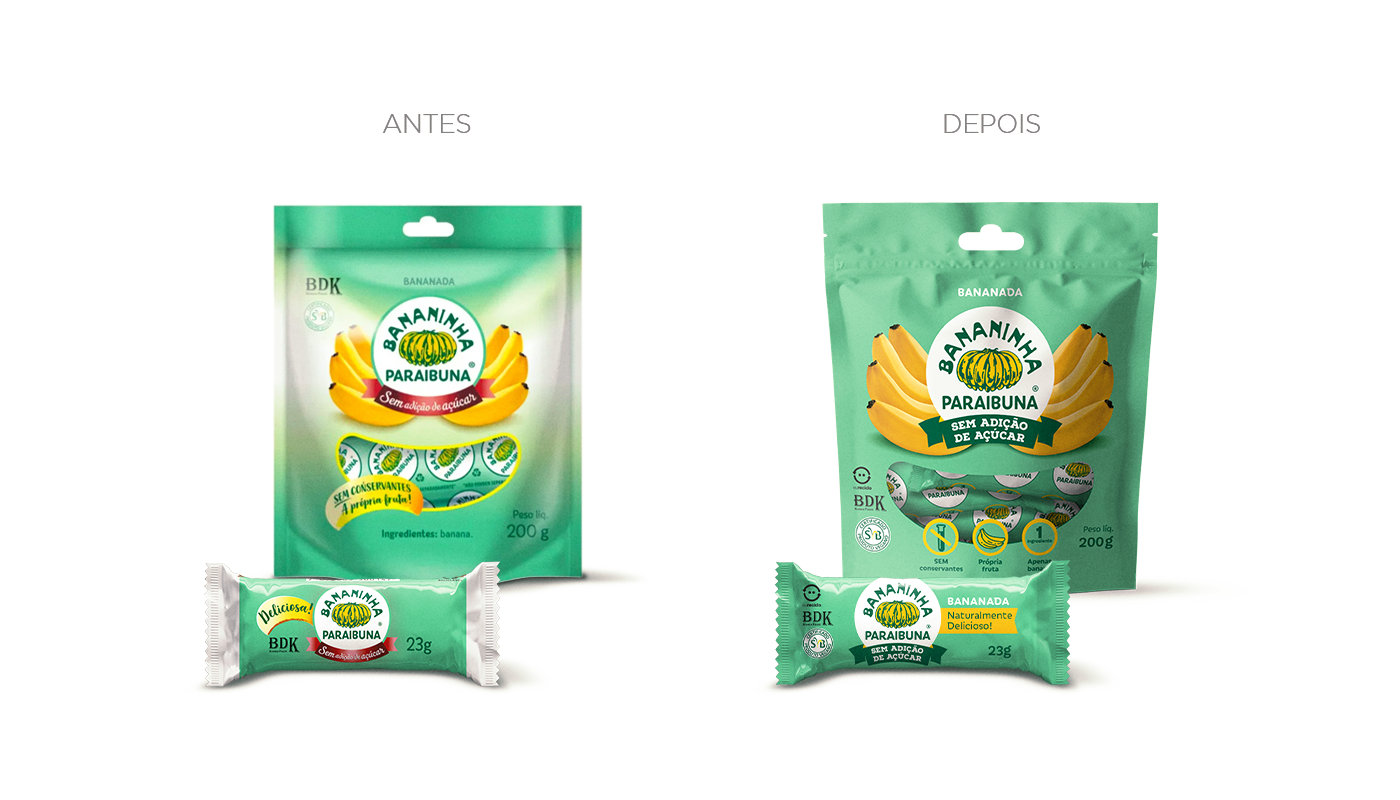
Os elementos atuais do layout dificultavam a sua aplicação em diferentes formatos e aumentavam a complexidade na impressão das embalagens. Com o redesign das embalagens e na escolha de fontes mais legíveis, conseguimos não só um visual mais contemporâneo como também aumentamos em 20% a visilidade da marca e legibilidade da variedade nas embalagens individuais (flowpack). Simplificamos as embalagens tirando o gradiente branco, e aplicamos o verde escuro na embalagem tradicional, assim aumentamos a diferenciação por variedade facilitando a escolha no PDV.
The current layout elements made it difficult to apply them to different formats and increased the complexity of printing the packaging. By redesigning the packaging and choosing more legible fonts, we not only achieved a more contemporary look, but also increased the visibility of the brand and the legibility of the variety in the individual packages (flowpack) by 20%. We simplified the packaging by removing the white gradient, and applied dark green to the traditional packaging, thus increasing differentiation by variety, making it easier to choose at the POS.

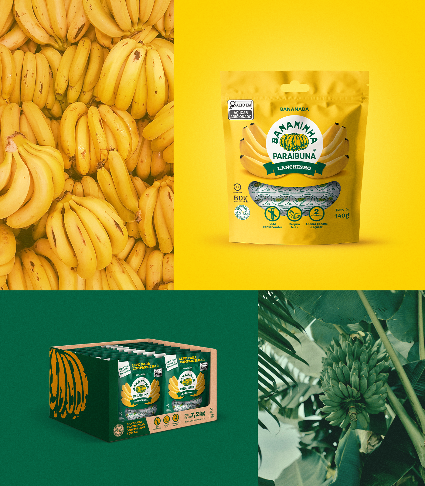

O projeto foi concluído em 8 meses, um período relativamente curto, levando em consideração os estudos do design, aplicação da nova legislação com tabelas e selos de advertência obrigatórios e o aproveitamento da janela para reposição de estoque de embalagens. No total foram 29 skus.
The project was completed in 8 months, a relatively short period, taking into account the design studies, the application of the new legislation with mandatory warning tables and seals and the use of the window to replenish packaging stock. In total there were 29 skus.